

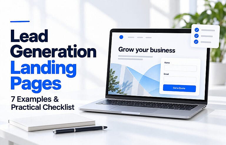
A lead generation landing page encourages visitors to share their contact details in exchange for something useful: a quote, consultation, demonstration, guide or assessment.
The strongest starting point is a clear offer for a specific audience. Visitors should understand what they will receive, why your business is credible and what happens after they respond.
This guide provides seven illustrative landing page concepts, with sample headlines, suggested form fields and calls to action you can adapt to your business.
What Is a Lead Generation Landing Page?
A lead generation landing page focuses on a particular enquiry or registration. Its main goal is to begin a relevant business conversation.
A homepage introduces the wider business and helps different audiences explore. A campaign landing page concentrates on the promise that brought someone there.
For example, an advertisement offering a carpet-cleaning quote should lead to a page about that service, its coverage area and the quote process. Google’s guidance recommends keeping the offer consistent between the ad and its destination. Google’s landing page guidance
If you are planning your broader website, our homepage design guide explains how its structure serves a different purpose.
7 Lead Generation Landing Page Examples
1. Local Service Quote Page
Example headline: “Carpet Cleaning in Richmond Hill: Request Your Quote”
This page suits homeowners who already know which service they need. Show the service area, what cleaning includes, genuine work photos and relevant customer feedback.
Suggested form fields include name, postcode, number of rooms and a preferred contact method. Ask for additional details only when they help prepare the quote.
Primary button: “Request My Cleaning Quote”
Explain whether the business will provide an estimate remotely or arrange a visit. Avoid promising an instant price if someone must review the request first.
2. Web Design Consultation Page
Example headline: “Plan a Website That Supports Your Business Goals”
A consultation page works for visitors considering a substantial project who need help defining its scope.
Explain who the consultation is for, what will be discussed and whether there is a charge. Show relevant portfolio examples and describe the next step after the conversation.
Suggested fields include name, email, existing website, project type and an optional budget range.
Primary button: “Request a Website Consultation”
If the form only requests an appointment, make that clear. Displaying “Booking confirmed” before a time has been agreed creates confusion.
3. Industrial Product Quote Page
Example headline: “Request a Pressure Sensor Quote for Your Application”
Technical buyers often need compatibility information before they can purchase. This page should help them communicate their requirements accurately.
Include available product types, useful specifications, relevant documentation and a contact route for uncertain buyers.
Suggested fields include company, work email, quantity, application and required specifications. Offer a drawing or specification upload when it helps the quoting process.
Primary button: “Request a Product Quote”
Provide an “I need help choosing” option. A prospect should not have to guess technical requirements simply to submit an enquiry.
4. Software Demonstration Page
Example headline: “See How Your Team Could Manage Inventory in One Place”
A demonstration page should explain which workflow the visitor will see and how the session relates to their needs.
Use real product screenshots and outline a few tasks the demonstration covers. State the expected duration if your team consistently follows it.
Suggested fields include name, work email, company size and the main problem the visitor wants to solve.
Primary button: “Request a Product Demo”
Clarify whether the next step is a live session, a recorded walkthrough or an introductory call. Those are different offers with different levels of commitment.
5. Downloadable Guide Page
Example headline: “Get the Small Business Website Planning Checklist”
A useful guide gives visitors a reason to share their details before they are ready to buy.
Show a preview and describe the decisions it helps them make. For example, a website planning checklist could cover page requirements, content preparation, essential features and launch responsibilities.
Start with email and, if useful, an optional first name. Explain how the guide will be delivered and how submitted information will be used.
Primary button: “Send Me the Checklist”
Deliver the resource promptly. A download request should not become an unexpected requirement to attend a sales call.
6. Webinar Registration Page
Example headline: “Plan Your First Google Ads Search Campaign”
A webinar page needs practical event details: the date, time zone, duration, presenter and learning outcomes.
Explain the intended audience and whether the session assumes any previous experience. Mention a recording only if one will actually be available.
Suggested fields include name and email, with an optional question for the presenter.
Primary button: “Register for the Webinar”
After registration, confirm how to join and provide calendar details. Keep the visitor focused on that event rather than introducing unrelated offers throughout the page.
7. Home Improvement Assessment Page
Example headline: “Explore Heating Upgrade Options for Your Home”
An assessment page can help visitors who have a problem but do not yet know which service or product they need.
Explain what the assessment covers, whether it is remote or on-site, and any associated fee. Use authentic team photos and relevant qualifications.
A short form could ask for postcode, property type, current heating system and preferred contact method.
Primary button: “Request a Home Assessment”
For a longer form, group related questions into clear steps. Explain that the assessment will help establish suitable options rather than presenting an unverified recommendation immediately.
A Practical Landing Page Structure
Use this sequence as a starting point, then adjust it to the questions your customers ask:
| Section | What it should communicate |
|---|---|
| Headline | The offer and intended audience |
| Supporting introduction | The problem addressed and expected next step |
| Relevant image | The service, product, resource or people involved |
| Benefits and scope | What is included and why it matters |
| Evidence | Genuine reviews, project examples or relevant credentials |
| Form and button | The information needed to take action |
| Common questions | Costs, suitability, timing and other likely objections |
| Business details | Who operates the page and how to contact them |
Repeat the main call to action where useful on a longer page. Keep its meaning consistent.
Reduce unrelated distractions while retaining access to information visitors need to evaluate the business, including contact and privacy details.
How Many Form Fields Should You Use?
Ask for the information needed to handle the next step properly.
An email address may be sufficient to deliver a guide. A technical quote may require dimensions, quantities or application details. Adding necessary qualification questions can be useful even if fewer people complete the form.
W3C recommends keeping forms short and requesting only relevant information. It also emphasizes clear labels, instructions and understandable error messages. W3C’s accessible forms guidance
Avoid using placeholder text as the only field label. Make optional questions identifiable, preserve completed fields when errors occur and show a clear confirmation after a successful submission.
Landing Page Checklist Before Launch
| Check | Confirm before publishing |
|---|---|
| Audience | The page addresses one identifiable customer need. |
| Offer | Visitors can understand what they receive and any conditions. |
| Message consistency | The headline and offer follow through on the advertisement or link. |
| Evidence | Reviews, credentials, photographs and claims are accurate. |
| Form fields | Every required question has a clear purpose. |
| Accessibility | Labels, keyboard navigation and error messages work properly. |
| Mobile experience | Text, buttons and fields remain usable on a small screen. |
| Performance | The page loads efficiently, responds promptly and avoids disruptive layout shifts. |
| Submission delivery | A test enquiry reaches the correct inbox or customer system. |
| Confirmation | Visitors know their request succeeded and what happens next. |
| Measurement | Completed enquiries are tracked without counting failed submissions as leads. |
| Follow-up | Someone is responsible for responding and recording the outcome. |
For performance testing, Google’s Core Web Vitals cover loading, responsiveness and visual stability. Review these alongside actual form usability rather than relying on a single speed score. Google’s Web Vitals guidance
Measure Qualified Leads, Not Just Form Submissions
A higher submission rate is useful only when the enquiries support your business goals.
Track these measures consistently:
- Lead conversion rate: Valid leads divided by landing page sessions.
- Qualified lead rate: Leads meeting your sales criteria divided by landing page sessions.
- Cost per qualified lead: Campaign spending divided by qualified leads.
- Customer acquisition cost: Relevant acquisition spending divided by customers won.
For example, imagine 1,000 sessions produce 50 valid enquiries, of which 20 meet your qualification criteria. That means a 5% lead conversion rate and a 2% qualified lead rate. These are illustrative figures, not industry benchmarks.
Define qualification before comparing results. It might involve service area, project suitability, quantity or budget.
When improving the page, test a meaningful change such as the offer, headline or form requirements. Avoid declaring a winner after only a handful of enquiries.
Our guide to website traffic without leads explains other problems worth checking when visitors fail to convert.
Landing Pages for Google and AI Search
For a public landing page intended to attract organic search traffic, provide useful information outside the form. Explain the service, who it suits, how it works and the questions someone should consider before enquiring.
Use descriptive headings, readable text and relevant internal links. Support claims with evidence that visitors can evaluate.
Google states that its AI search features follow established SEO fundamentals and require no special AI markup. Eligible pages must be indexed and able to appear with a search snippet; inclusion is not guaranteed. Google’s guidance on AI search features
For related improvements, see our SEO-friendly web design tips.
Frequently Asked Questions
What Makes a Good Lead Generation Landing Page?
A relevant offer, clear explanation, credible evidence, usable form and dependable follow-up process. The right combination depends on the audience and the commitment you are asking them to make.
Can a Landing Page Replace a Website?
A single page can support a focused campaign. A broader website is useful when customers need to compare services, review your work or investigate the business before contacting you.
What Are Common Landing Page Mistakes?
Vague offers, excessive form questions, unsupported claims, broken submissions and unclear next steps. Another mistake is treating every enquiry as equally valuable without checking whether it becomes suitable work.
Build Around a Clear Next Step
Choose the offer that best matches your customer’s current need. Explain it plainly, ask useful questions and make the response process reliable.
If you need a landing page that connects your advertising with a clear enquiry journey, explore HMDIA’s website design services.