In an era where mobile devices dominate online interactions, mobile-first design has become a cornerstone of effective website creation and marketing. This design philosophy prioritizes the mobile experience over desktop, ensuring that websites are optimized for the small screens most people use. In this blog post, we’ll explore what mobile-first design is, why it’s crucial for modern marketing strategies, and how to implement it successfully.
What Is Mobile-First Design?
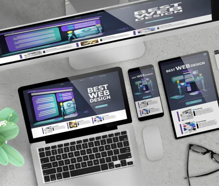
Mobile-first design is a design approach that starts with creating a website for smaller screens (smartphones and tablets) and then scales up for larger devices, like desktops. This method ensures a seamless user experience across all screen sizes and prioritizes functionality, simplicity, and speed.
Rather than retrofitting a desktop design to work on mobile devices, mobile-first design emphasizes the essential features and content that users need most.
Why Mobile-First Design Is Crucial for Marketing
1. The Dominance of Mobile Usage
As of 2025, over 60% of global web traffic comes from mobile devices. Consumers use their phones for everything—from shopping to researching brands and engaging with social media. A website that isn’t mobile-friendly risks losing a significant portion of its audience.
2. Improved SEO Rankings
Google’s mobile-first indexing means that the search engine primarily uses the mobile version of a website’s content for ranking. A site that isn’t optimized for mobile could experience a drop in visibility on search engine results pages (SERPs), directly impacting your marketing reach.
3. Enhanced User Experience
Modern users demand fast-loading, intuitive, and visually appealing websites. Mobile-first design delivers this by prioritizing performance on smaller devices. Satisfied users are more likely to stay on your site longer, reducing bounce rates and increasing the chance of conversions.
4. Higher Conversion Rates
A website that works seamlessly on mobile can turn casual browsers into loyal customers. Whether it’s a one-click checkout process or engaging calls-to-action, mobile-first design helps drive conversions by meeting users where they are—on their phones.
How to Implement Mobile-First Design
1. Simplify Your Layout
Start with a clean, minimalist design that focuses on essential elements like navigation, content, and calls-to-action. Avoid clutter and prioritize ease of use.
2. Optimize for Speed
Mobile users expect fast load times. Use compressed images, clean code, and efficient hosting to ensure your site loads in under three seconds.
3. Focus on Content Hierarchy
Place the most important information at the top of the page. Use clear headings, concise text, and visually engaging elements to guide users through your content.
4. Use Responsive Design
Ensure your website adapts to various screen sizes. Responsive design ensures that elements like text, images, and buttons resize and reformat seamlessly on any device.
5. Test, Test, Test
Regularly test your website on multiple mobile devices and browsers to identify and fix potential issues. Tools like Google’s Mobile-Friendly Test can help ensure your site meets mobile usability standards.
Conclusion
Mobile-first design is no longer optional; it’s a necessity in today’s digital landscape. By prioritizing mobile users in your design and marketing strategies, you can improve user experience, boost SEO rankings, and drive conversions.
Make the shift to mobile-first design today, and watch your marketing efforts thrive in the mobile-driven world.
Our complimentary listing service is the perfect solution to help your business shine and attract potential customers.
By opting for our free listing service, you can access a vast network of potential customers actively seeking products or services like yours. Our platform bridges the gap between your business and your target audience, making it easier than ever to connect with interested individuals ready to engage with your brand.

